The Inference Centipede
Visualizing the tracing data from LLM runs
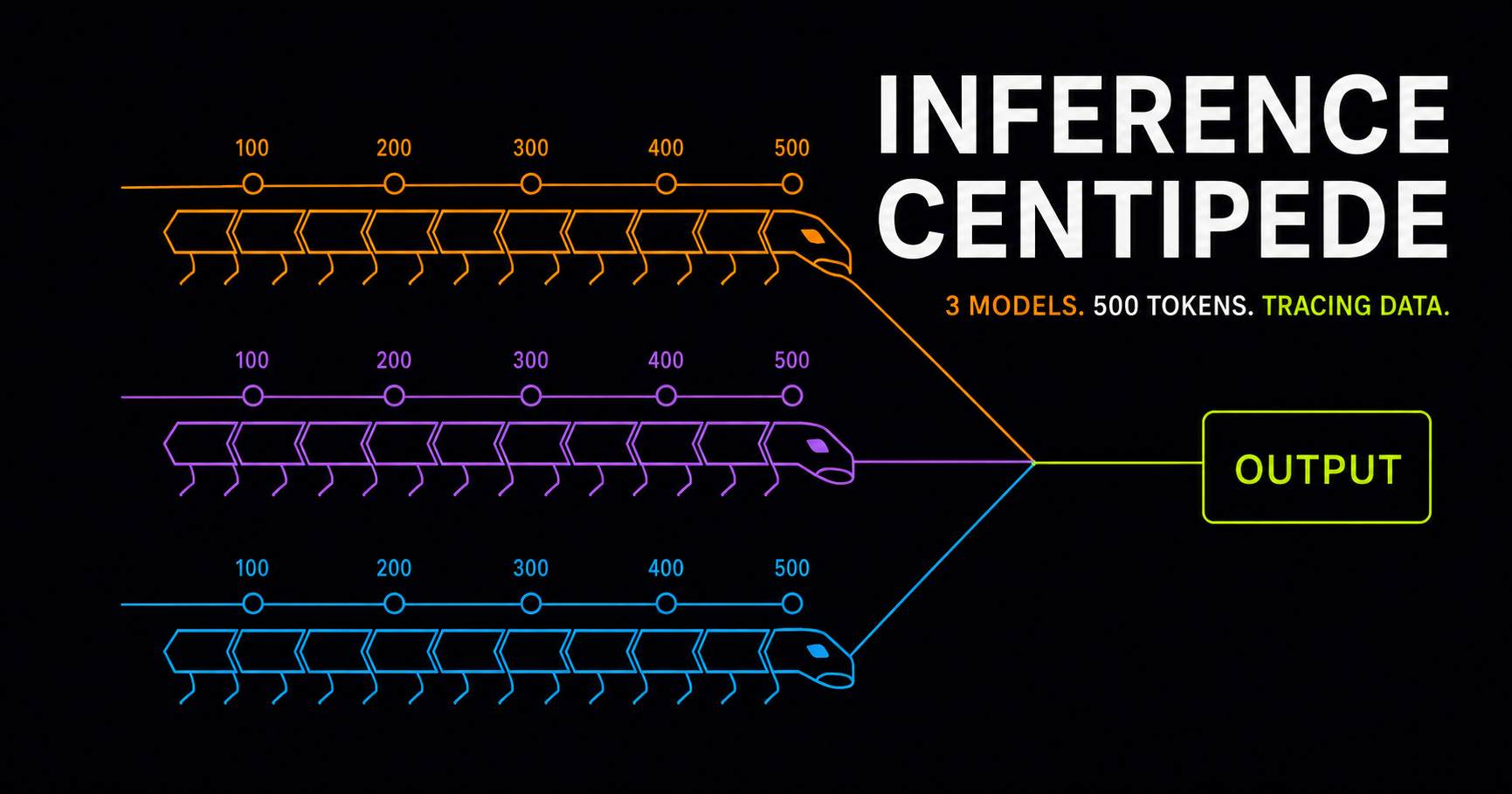
Short one today.
What happens when you have an inference engine where you track the entropy and margin per token? What if you had a tracing span across the forward pass, every layer, every matrix, and every norm that was clocking every op to the nanosecond?
What would that look like?
First, you get all kinds of great boring data. You see millions of loops that do the exact same thing. It is both useful, and useless. Anybody that has done any kind of profiling work will tell you that most of the data is not useful. This is why we do not profile live hot systems. The cost of profiling is high. It costs compute/memory/disk resources, and is crazy hard to keep simple.
This cost approximately 380KB per token, and 5x performance slowdown to be able to measure at the nanosecond level. The bloat is unsustainable on a live running system. Same as with any profiler.
So I did it for you, I built an inference engine with token-level parity with the python running reference systems, and I have this tracing data.
How can I visualize it?
I asked Claude to help me design a way to explore the data. Through many series of iterations of visualizations, one stood out. It had a funny look about it, almost like a centipede.
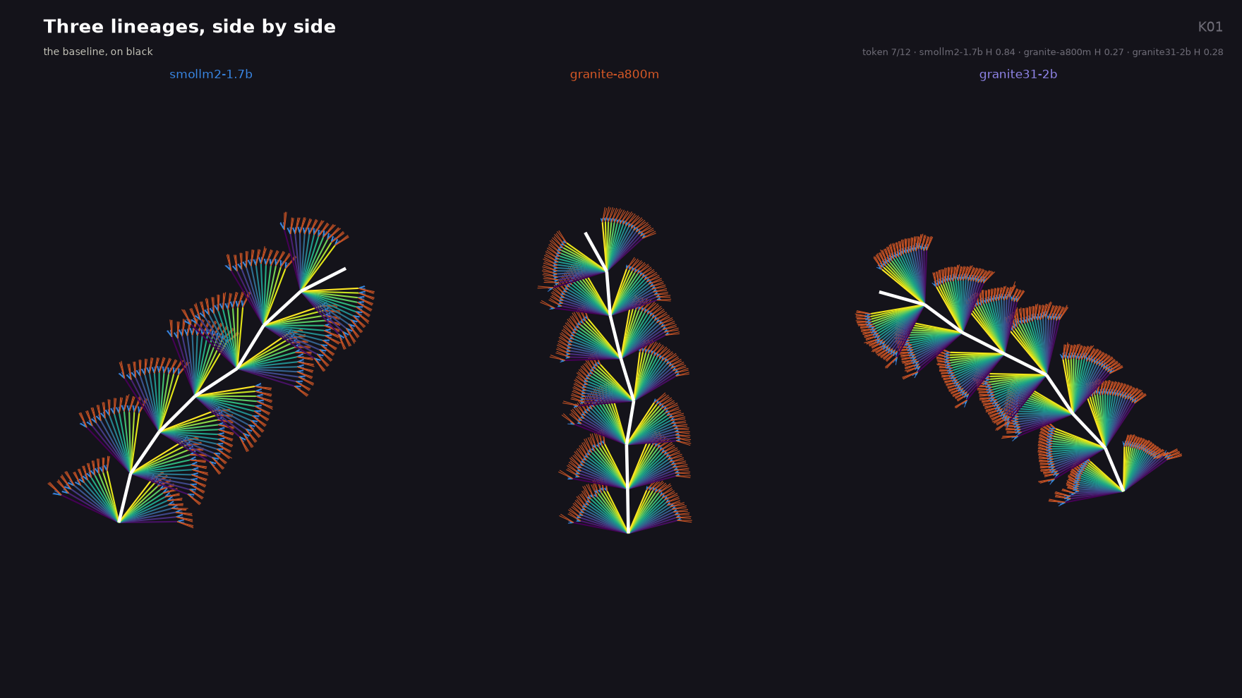
What is this showing?
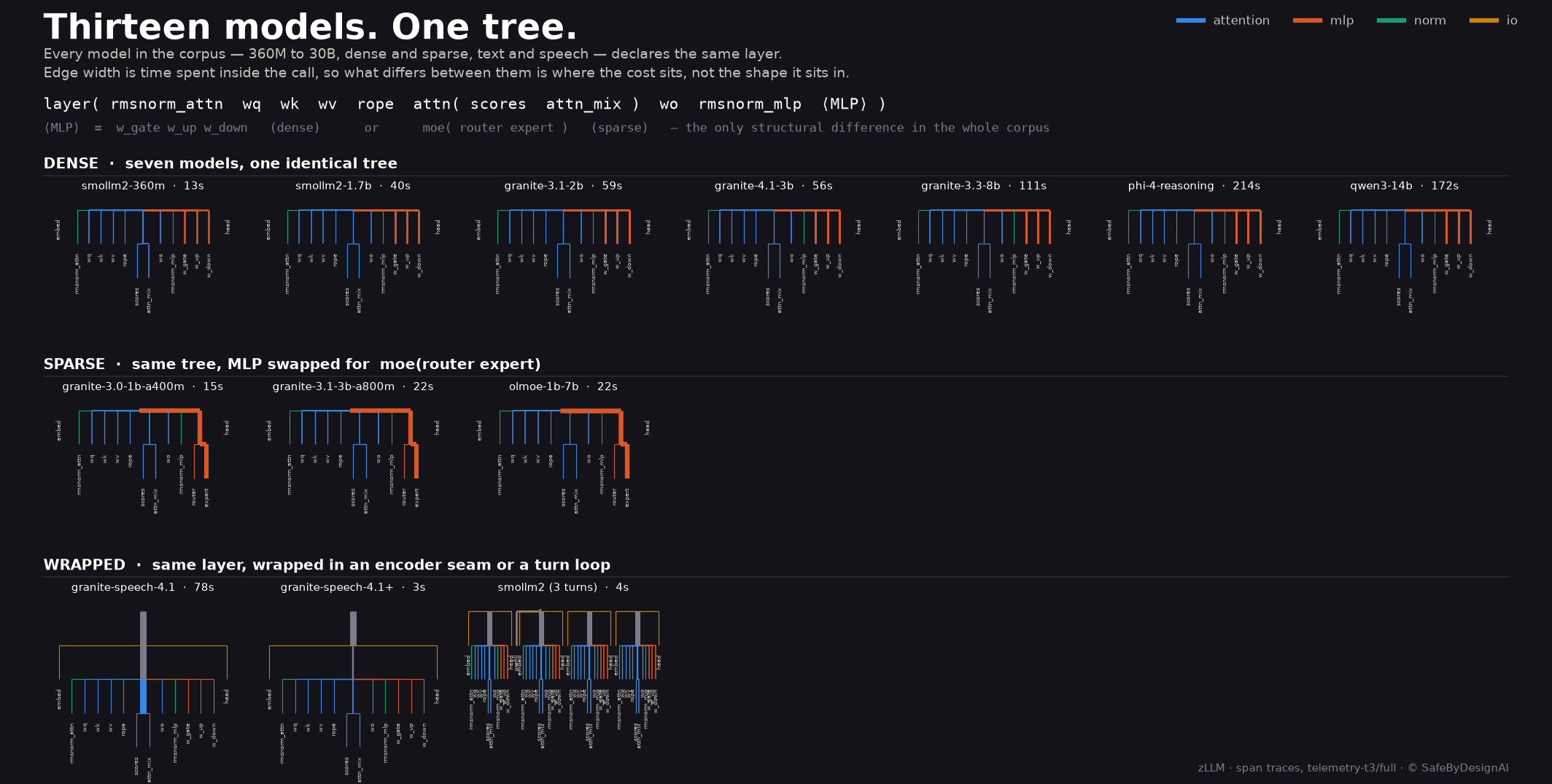
The trace data is tracking the compute calls, and the data looks like this in the most basic form. Every model has different paths through the kernel, and it forms a tree like structure:
Through many iterations, I was able to complete a video that showed the entire process of 3 text models writing a story: phi-4-14b, granite-4.1-30b, qwen-3-14b
As you know, I use Suno for the Music. I use it to narrate and to highlight the power of AI generated Music. It is not something I endorse, despite my heavy use.
Enjoy, and stay safe.
“The Inference Centipede” * animation was synced to the Music, not real data variance; for watchability